Mark Abrams on Designing Motherthing

Mark Abrams, enduring cover designer at Vintage/Anchor, Penguin Random House, lives in Brooklyn (of course) with his local pod. He will update his website any day now. Here he takes us through his process for designing Motherthing.
Motherthing is dark, weird, funny. The protagonist, Abby Lamb, is a wife desperate to get pregnant, but her husband can’t commit, as he’s hopelessly depressed by the death of his mother (i.e. Abby’s mother-in-law), who is haunting him. Abby starts off as a bit cheerfully unhinged, obsessed with a retro fantasy of domestic life of bliss and potential mothering, making dishes like jellied salmon—which haunts the book as frequently as her mother-in-law’s ghost from the basement—and she graduates to fully unhinged by the book’s end. There might be a bit of murder and cannibalism, depending on how reliable you find the narrator.
OK, so: first, good news. If you’re a cover designer reading this (“me?” you gasp, blushing behind your folded, dog-eared copy of Spine) you know how these things can go. Tortured or easy. This one went easy. I enormously enjoyed the book’s authorial voice and connected with the vibe of the book, so fell headlong into the zone and emerged soon after with a bunch of designs. Here they are:


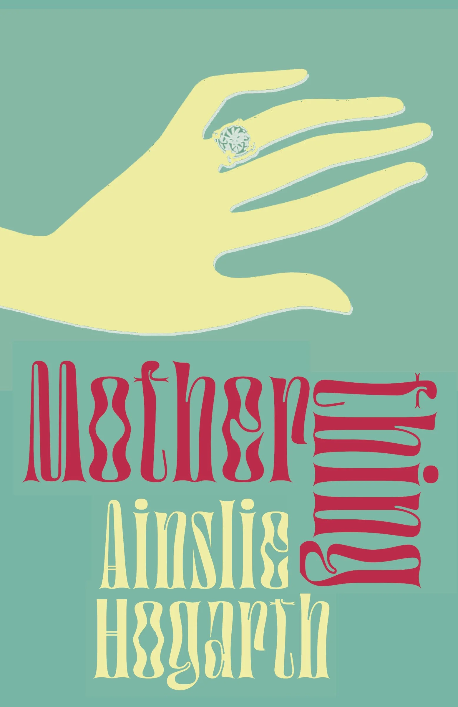


Caitlin, the plucky editor, and the whole editorial team really liked the triptych of face/ring/gelatin. So we showed it to the author, and she liked it too! In fact she wrote a lovely letter about it, which is above and beyond. Done & done.
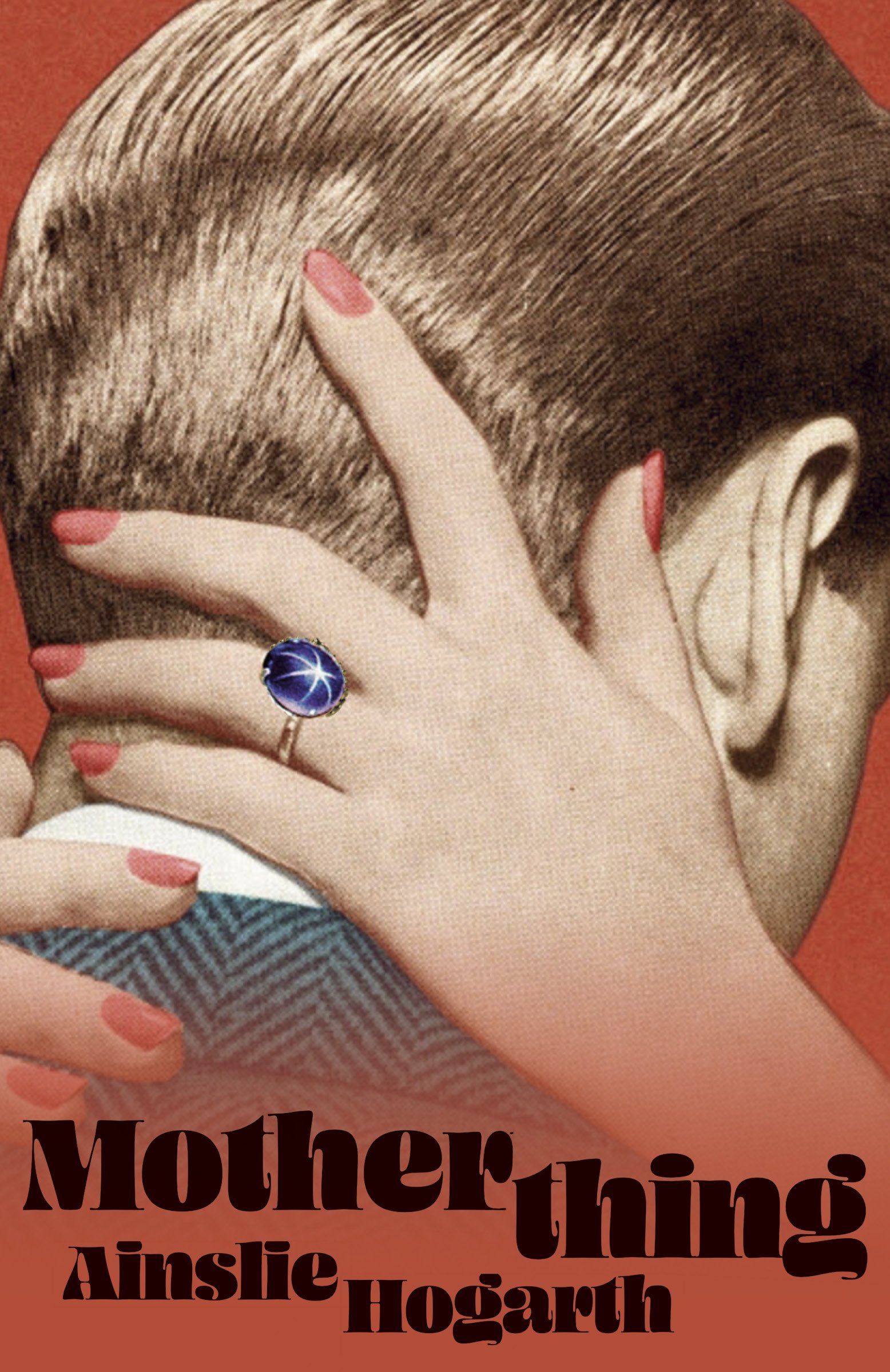
But now we get to the juicy part of the story, something that design historians just one day might call The Saga of Davis Dainty Dishes, (1939). The image of the jellied salmon (see first paragraph, above), which was so helpful in evoking the texture of this story, was scrounged from the depths of the internet, originally from a gelatin company catalog called Davis Dainty Dishes (1939).* Surely an image from the dustbin of history, no worries with copyright, yes? Well, no. Our intrepid art manager Jenny discovered the Davis Corporation, based in Australia, was alive and well, they still owned every aspect, and they had to grant approval for usage. This made me nervous, as an important part of this design had come to rely on a gelatin company approving the usage of their image of jellied salmon for a novel whose protagonist goes increasingly insane and quite possibly does something…. well, terrible, with an associated food item.
But reader: they approved it. I don’t know why or how that decision was reached, but I don’t need to know. All was well—the aspic made the cut.
* I recommend googling this if you’re keen on time-traveling back into a curious culinary age.
Final cover
Editor, artworker and lifelong bibliophile.