Joe Wilson, Using Illustration to Bring The Sealwoman's Gift to Life
Joe Wilson is an award-winning illustrator based in England specialising in highly detailed, hand-drawn illustrations and print. Working with a combination of pencil, ink and digital colour, Joe's work takes form as a hybrid of the traditional and contemporary. Here he explains his process for designing Sally Magnusson’s The Sealwoman’s Gift.
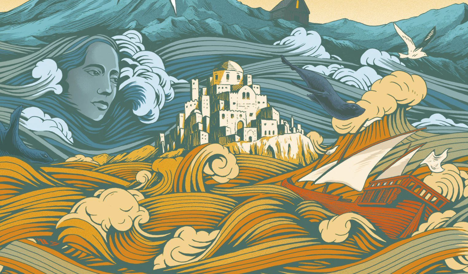
The Sealwoman’s Gift is the debut novel by Sally Magnusson and I had the great pleasure of bringing the cover to life. The book is a story about loss and love, set during a true incident in Icelandic history in 1627, when Barbary pirates raided an Icelandic island and abducted the 400 inhabitants into slavery in Algiers. Working alongside Art Director Sara Marafini at John Murray publishers, we decided the contrast of these two settings was something we could use to create a beautiful cover to wrap this book in. I was provided with a package of reference material, including my own work, extracts from the novel and some ideas Sara had about the direction. From here I started to develop some very rough thumbnails to try and plot out a rough composition and idea for the piece.


From these thumbnails it was decided that the illustration would be a stylised land and seascape, which transitioned from the cold waters of Iceland on the front, to the warmer climes of Algiers on the back cover. Once this was decided I could start to plot out the cover in more detail.
This is the way most of my work happens, and at this stage I am working in pencil only. I like to produce a very tight pencil drawing which helps me in the following stages of the artwork, but also gives the art director and the publishers a really clear idea of how things will look at final stage. It’s one of my favourite parts of the process as I get to spend more time working on the details and things come to life a bit more.
As the cover started to take shape mainly as an Icelandic seascape, I included a woman’s head intertwined within the waves. This became the focus of the cover in the end, and, I think, provides a nice air of mystery and intrigue.
The back cover focused on Algiers and includes a ship typical of the time and location, and a landscape reminiscent of the buildings of that time. I pulled some reference for this but obviously correct reference is hard to find.
I added some smaller details throughout the cover and also on the French flaps and after a couple of small edits I was approved to move to ink and colour.
I ink my drawings by hand and then scan into the computer to add colour digitally. Our colour direction was very much led by the subject mater and it was a case of trying to meld the blue-greens of the Icelandic sea with the warm orange hues of the Algerian coastline. I felt that the stylised sea offered me a way to delicately introduce the colours to one another without a jarring change, and the spine came in handy to help navigate that change.
Sara and her team worked on the type for the book which resulted in a subtle, simple and delicate finish utilising both the blue and orange of the illustration.
The last piece of the puzzle was to design some basic endpapers that give the book a nice consistent finish. These were produced by creating a repeat of the wave design from the cover illustration and introducing some seals swimming through.


It was a really lovely project to be involved with, and after release it was selected for Zoe Ball’s book club, so we produced a special cover for that paperback edition which incorporated the whole illustration on the cover.
Editor, artworker and lifelong bibliophile.