Erin Fitzsimmons & Simon Prades, They Both Die at the End

Erin Fitzsimmons is a book cover designer for Harper Collins. Here she shares for Spine how she and Illustrator Simon Prades created the cover for Adam Silvera's They Both Die at the End.
They Both Die at the End is not only one of my favorite books I’ve ever worked on, it is also one of the best books I’ve ever read. It grabbed me from the beginning and kept me up late at night, and stayed with me long after I finished it. One of the things I love most about the book is that even though the title contains the word “die”, the book is really about life, and living that life to the fullest. It left me feeling inspired about way more than just designing the cover.
My initial inspiration for the cover came from the clever and ominous title itself. My rough thumbnails were playing with visuals of death (mostly skulls and the grim reaper), the city skyline, and the characters. I also wanted to convey all the overlapping layers to the story and the characters within the book, so I knew we had to add depth to [the] cover and the jacket. I started sketching while reading, and playing with ways to blend all of these ideas and the title in an intelligent and interesting way.


I have been a fan of Simon Prades’ work for years. What always strikes me about his work is his ability to combine concepts in a deep and meaningful way, so he was the first artist I thought of for this cover! I knew he would bring the grit and the gravity we were looking for, but his colors and style are never too depressing. (With a title like They Both Die at the End, “too depressing” is definitely a concern.) And of course it didn’t hurt that he knows how to draw a mean looking skull!


I sent my very rough little thumbnails to Simon and he took those initial ideas and ran with them. This is my favorite part about being a book designer. I have zero illustration skills but luckily I am able to hire very talented illustrators who have the skills to take my concepts from thumbnails to actual pieces of artwork. Simon absolutely crushed the first round of sketches. I would’ve been thrilled with any of these sketches going to final art.


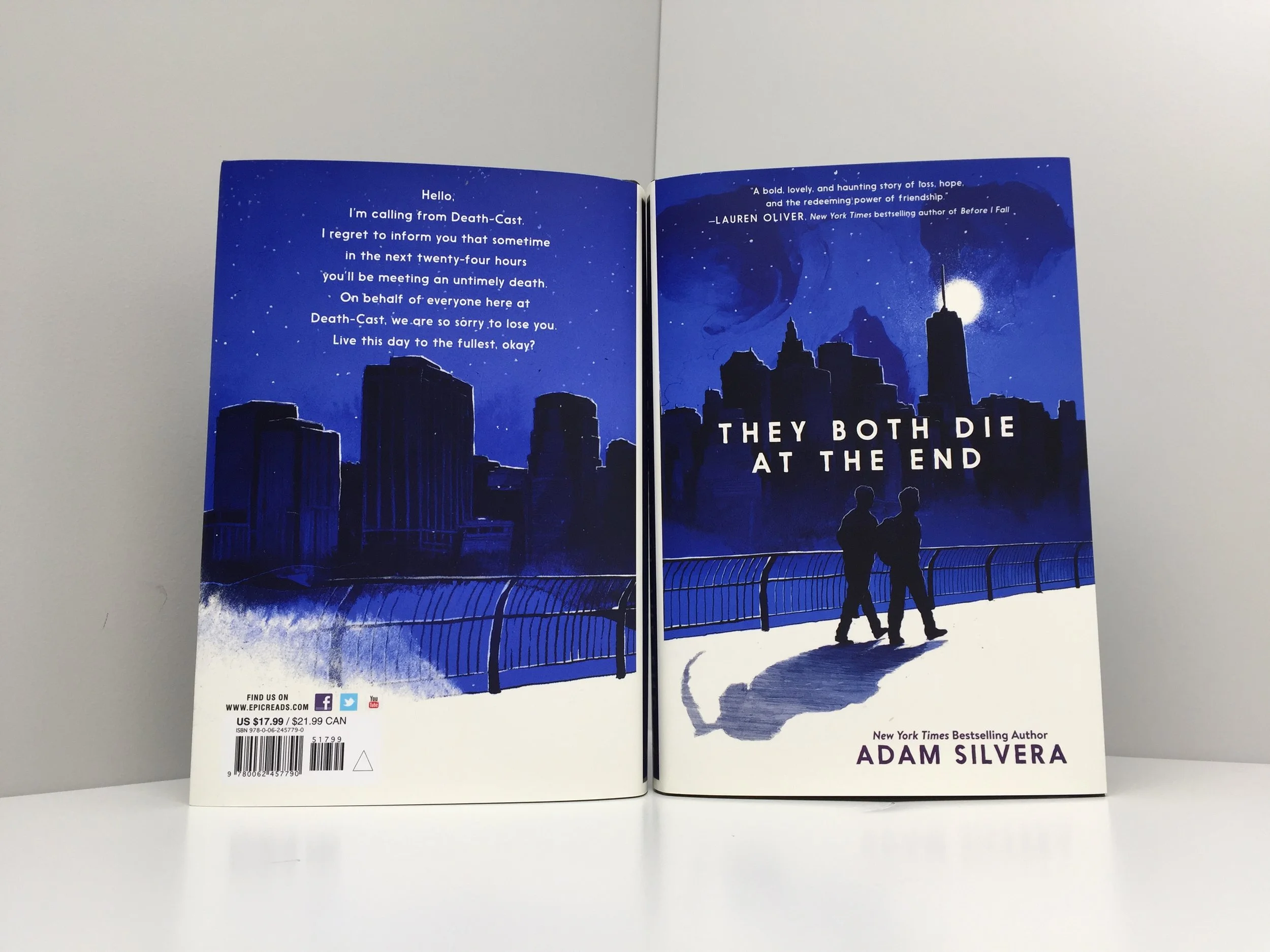
In the end, the team really loved the silhouettes against the city skyline, as well as the subtle hint of the skull in the sky. We asked Simon to turn the shadow into a grim reaper, and then it all started coming together.
We went through a few rounds of tinkering with the colors, the silhouettes, and the type placement, and we landed on our final cover art! We also commissioned a back cover piece so the city scene would wrap around to the back cover. I love that even though we revealed the cover months ago, lots of readers are still discovering the skull and grim reaper. I’m always the last person to pick up on hidden, subtle elements like that, so it’s even more fun for me to watch people discover them!
The final piece of the puzzle for this book jacket was to get the printing just right. We fell in love with the screen colors for this artwork, but the printed colors were not living up to our desires. This vibrant blue-purple color is very hard to achieve in CMYK and was dying a premature death on the galley cover, so we went through an extensive process to find the right Pantone spot color that would bring this color to life in print.
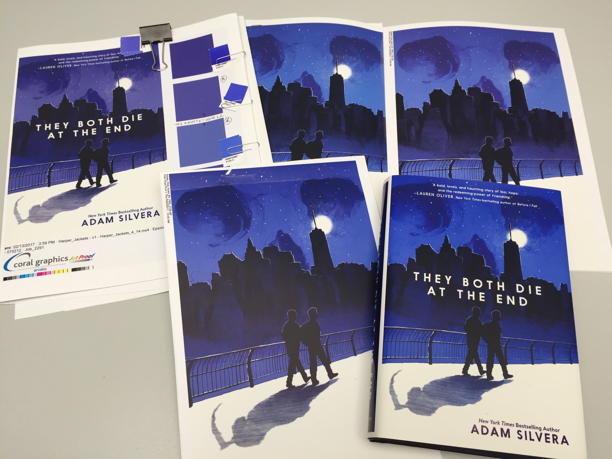
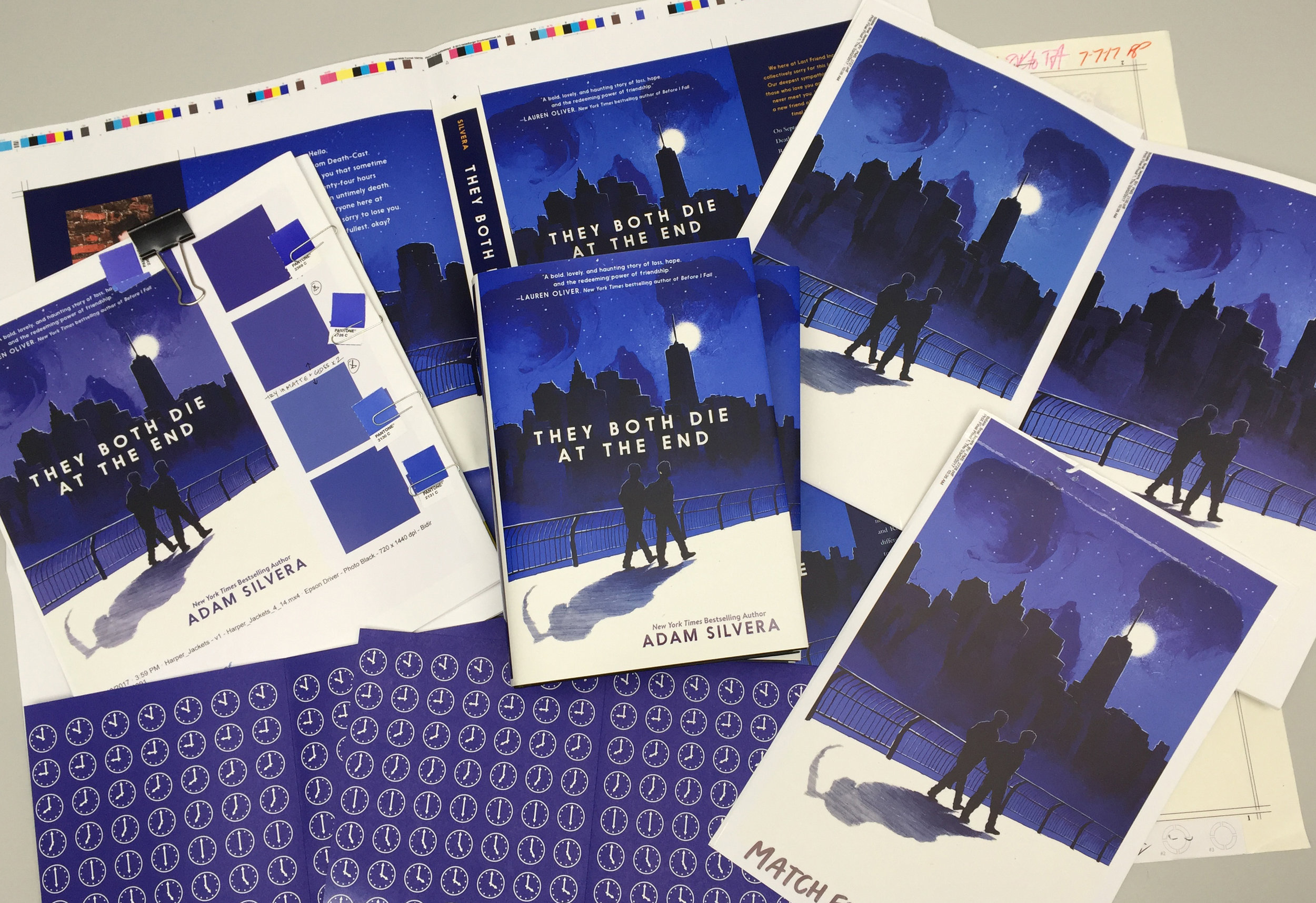
I couldn’t be more proud of the finished product. Everything came together beautifully! One last detail we included were printed endpapers with a countdown clock and skull pattern that I had a lot of fun designing, and really help to tie the whole package together.

Join us in celebrating the enormous talent that goes into book cover design. Consider a small donation to our Patreon fund. Your support helps us provide you with an in-depth look at some of the book publishing industry's most creative people.
www.patreon.com/spinemagazine
Mary Ryan Karnes is a freelance writer and a Master's candidate in fiction at the University of Southern Mississippi.