Emma Rogers on Lettering, and the Ludicrous Laws of Old London
Emma Rogers is a Graphic Designer specializing in book cover design and lettering. She is a recipient of the prestigious D&AD Yellow Pencil Award for her cover designs in 2008. She also won an ABCD award in the Mass Market category for her design of The Scent of Death in 2014. Here she answers our questions about her work.
How did you get into the business of book cover design?
I started out doing a BTEC Foundation course in Bournemouth followed by a BA(Hons) in Graphic Design and Visual Communication at Kent Institute of Art and Design. After a few months of post university travelling, I was very lucky to get 3 days work experience in-house with the design team at The Orion Publishing Group. Fortunately for me, timing was on my side and what was only meant to be a few days of shadowing, turned into a six year stint as part of the team. In this time, the fabulous Creative Director, Lucie Stericker, took me under her wing and gave me the most incredible opportunity to showcase what I was capable of. I eventually moved on to Random House as a Senior Designer before taking the step to go freelance.
What has been your greatest design challenge?
Although not a recent design, this has to have been the Future Classics series I designed for Gollancz, the science fiction branch of Orion. The brief was to repackage a set of well known titles from various authors and bring them to a new, younger audience. I was told to simply 'do what you want' which to some, might have sounded like the dream brief but firstly, I was no science fiction expert and secondly, I was repackaging some big SF authors for the series. There was a lot of pressure to come up with something completely different.
From the outset, I wanted to keep the series design simple and clean, extracting one poignant moment from each title to reflect boldly on the cover. It occurred to me that if we could get away with printing absolutely nothing aside from the illustration on the (front) cover we could really have something new and groundbreaking in the way of book cover design. To keep costs down, I illustrated most of the covers myself so that we could put more of the minimal budget towards production. The illustrations were all very simple and in a style suitable to the content. I spent a lot of time researching cover stock and matching appropriate specials to each of the titles, using uncoated stock, glow in the dark ink, flock and iridescent paper to really lift each illustration and give it an added dimension. To start with I designed a number of throwaway author/title stickers and bellybands to appease those who were more nervous about the proposed approach but I always had a glimmer of hope that they would eventually be unnecessary and that we could push forward with the stark designs. I was astounded when they were approved without the need of additional stickers and although, as expected, some bookseller chains were apprehensive about this idea, luckily Gollancz and the rest of the team stuck by them and were confident in their stand-out simplicity.
After six months of being printed, the series were entered into the D&AD awards where they won a yellow pencil. It was the first year that book cover design had had a category of its own, so all the perseverance finally paid off.
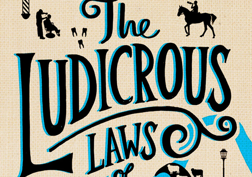
Can you explain your process for designing The Ludicrous Laws of Old London?
When I received this brief from Little, Brown Book Group, I was desperate to get cracking. The brief was to come up with something typographic and aesthetic that would be sold in the gift book section. The subject matter had me intrigued from the start and I learnt so much about the strange (and often unbelievable) old laws of London in the process. I began by researching old traditional English typography and designing my own lettering styles. Once I had a few strong typographic routes, I picked laws from the manuscript that were fun to illustrate in and around the type. The Thames and the London skyline were my two initial illustrative constants but it was the shape of the Thames that ended up working more sympathetically within the overall design. I loved the whole design process with this one and when LB told me they wanted to go with a non standard format with black and blue foil printed straight onto the board, it was the icing on the cake!
What piece are you most proud of?
This has to be my hardback design for When She Woke by Hillary Jordan. The book begins in an undetermined future where 26 year old Hannah Payne wakes up in a prison cell having had her skin pigmented red to symbolise the murder of her fetus. I really wanted to design a purely typographic cover that would depict the first part of the story to create the setting. I absolutely loved illustrating the lettering for this piece and was so pleased when this route was approved. We managed to get red sprayed edges signed off too which finished it off perfectly.
What's your favorite book, be it for design or story?
My favourite all time book has to be Lovely Bones by Alice Sebold. I read this book when it was first published. It wasn't a book I would normally have picked up but it was recommended to me by a good friend. It's a story that has stuck with me ever since as it was beautifully written and really made me stop and take a moment to appreciate life, loved ones and friendships.