Emma Pidsley on Designing Wandering Souls

Emma Pidsley is a cover Designer at 4th Estate and William Collins, Harper Collins Publishers. Here she gives us a peek into her process for designing the wonderful cover for Wandering Souls.
Wandering Souls follows the journey of three siblings as they flee their Vietnamese village at the end of the war and embark on a perilous boat journey to Hong Kong, which tragically, the rest of their family do not survive. They go on alone to navigate refugee camps and resettlement centres until arriving in Britain. As they strive to find a new sense of home and connection, the siblings’ narrative is interwoven with the voices of their lost brother Dao, and an unknown researcher who pulls together fragments of their story. This felt like a special novel from the outset, and an important story to tell. It was clear that the cover needed to look unique and captivating, but also convey the sense of loss and heartache at the centre of the story.
My starting point was to pull out some evocative imagery from the text that could be explored creatively to create a fresh visual whilst avoiding anything too cliché or directly representative of the characters. I was drawn to the siblings’ warm memories of home, the nostalgia of cooking and the steaming rice. The steam and smoke visuals also reflect the haunting aspects of the book - Dao’s ghostly presence, the lost souls. The writing is also suffused with ethereal and expansive images - moonlight and shadow, the dark water of the siblings’ journey, and the lonely landscapes. The flowers that reappear as a hopeful and homely symbol also stood out as an important visual theme.


A lot of concepts I explored first ended up looking too abstract and purely atmospheric – I needed to find some sort of key illustrative motif that could translate well to an integrated marketing campaign whilst retaining that thoughtful, literary feeling. The brief asked to look at working with an artist – I commissioned Xuan Loc Xuan, whose work I had admired on Instagram. She creates an ethereal, otherworldly atmosphere in her art which is also tinged with melancholy, and suited the kind of mood that the cover needed. I asked Xuan to explore some rough visuals after briefing her with the imagery I had pulled out.


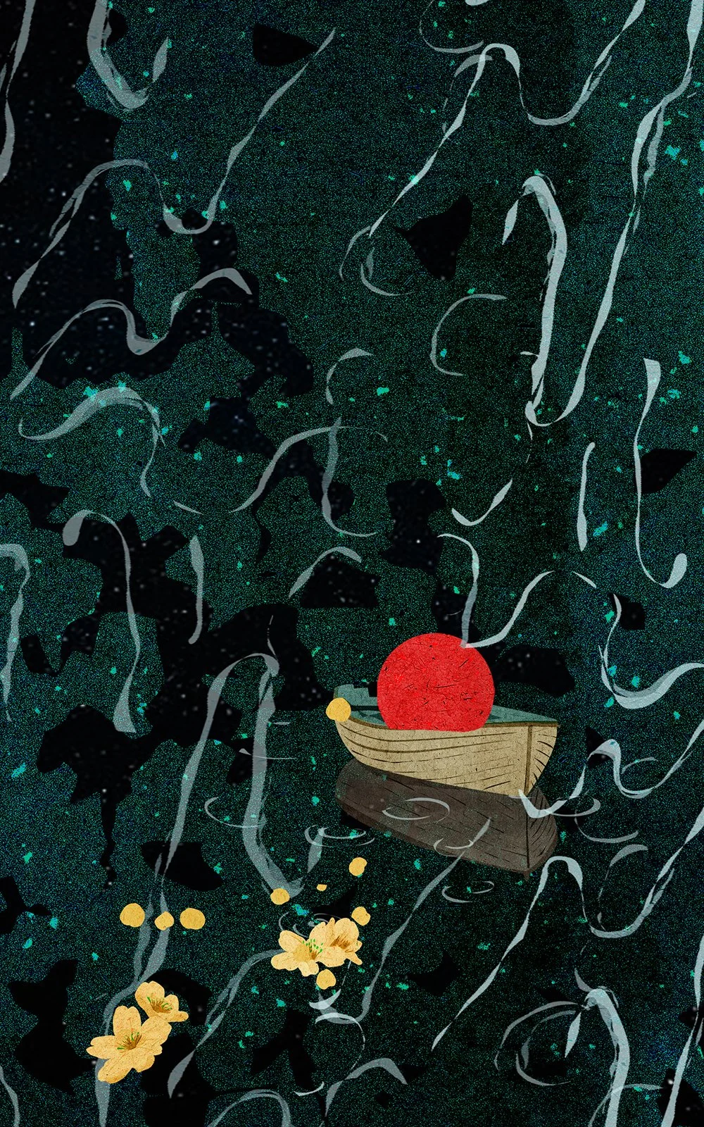
We were originally looking at Vietnamese landscapes, but the developments quickly became less scenic and more graphic. I loved the visual impact of the smoke shape from the roughs, which served as the frame for the other elements to come together. It was important that the central image did the story justice - the flowers were beautiful but somehow didn’t carry enough emotional weight. Xuan’s depiction of the moon within the boat created the unique but bold image that was needed. I then refined the typography, choosing a neat sans serif that really allows the artwork to sing out. The colour palette needed to avoid being too bright or cheery whilst ensuring that the cover was bold enough to make this powerful debut as visually impactful as possible. The red gives this boldness but is appropriately softened by the yellow petal shapes, Xuan’s lovely textures and the starry background, with the blue foil adding that final eye-catching element to the cover.
Final cover
Editor, artworker and lifelong bibliophile.