Alban Fischer on Designing Till the Wheels Fall Off

Alban Fischer is a book cover designer, poet and founding editor of Trnsfr and Trnsfr Books. Here he takes us through his process for creating the mind-bending cover of Till the Wheels Fall Off.
Till the Wheels Fall Off is the story of Matthew Carnap, newly returned to his hometown, looking back on his past and ruminating on love, connection, nostalgia, and grief as he attempts to come to terms with his strange childhood, much of which was spent in the company of his music-obsessed stepfather who owned and operated a roller-skating rink above the local fire station. Matthew and his stepfather, Russ, bond over their love of music.
The publisher, Coffee House Press, noted that they wanted the cover “to have a mood.” Immediately upon reading the book, I knew I wanted to provide a couple of options with a retro ’80s feel, which also seemed in line with the author’s expressed partiality to clean, classic album covers with strong graphic elements. I was glad the publisher was game to pursue this direction as well.
The brief cautioned against an overemphasis on roller-skating, which presented a slight challenge considering the centrality of the skating rink to the narrative. So in the first option I tried to represent this element of the story in what I hoped was not too heavy-handed a way by creating an overhead view of a roller rink in the form of a human head. I wanted the color palette, type, and layout to evoke vintage ’80s paperbacks.
The author is a big fan of the work of Ben Shahn and Saul Bass, so of course I couldn’t pass up an opportunity to try something in their style for this concept, but ultimately I didn’t feel these quite worked (or that it was the right direction for this cover) and so didn’t show those options.
The narrator, Matthew, and his stepfather, Russ, are obsessed with creating the perfect skate mix, so mixtapes also came to mind as a direction. For the second option, I mocked up a recording cassette J-card with the title scrawled in black marker.
But neither of these options quite do the book justice.
For the third option, I wanted to represent the sense of chaos or disorientation—the whole maelstrom of adolescence, divorce, and hard knocks that the narrator takes us through. The halo of a skating rink, the blur of roller-skate’s wheels, the spin of a record—and particularly the graphic funkiness of the vintage funk, soul, and R&B records mentioned in the book—all seemed to beg a visual synthesis. So for the third option I repeated the title in Edward Benguiat’s Avant Garde and warped it. I also like the super-tight tracking you see in a lot of type treatments from the ’80s, so I wanted that look here too.
The publisher asked that I try a few things to break up the type—perhaps adding a bolt, as on a skate’s wheel, or a 45 RPM adapter. And for the sake of readability, they asked that there be a line at the top where the type wasn’t warped and wanted to try it in a few different colors.
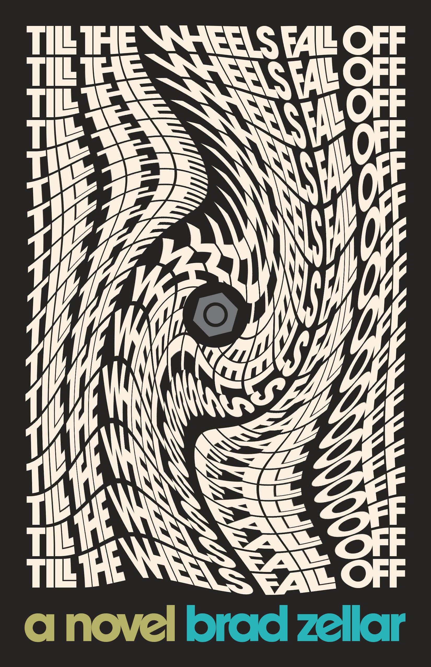


But ultimately, they chose just the type in all one color.
Final cover
This book was a pleasure to work on and I think we arrived at a cover that best represents Brad Zellar’s strange, fun, and beautiful novel.
Editor, artworker and lifelong bibliophile.