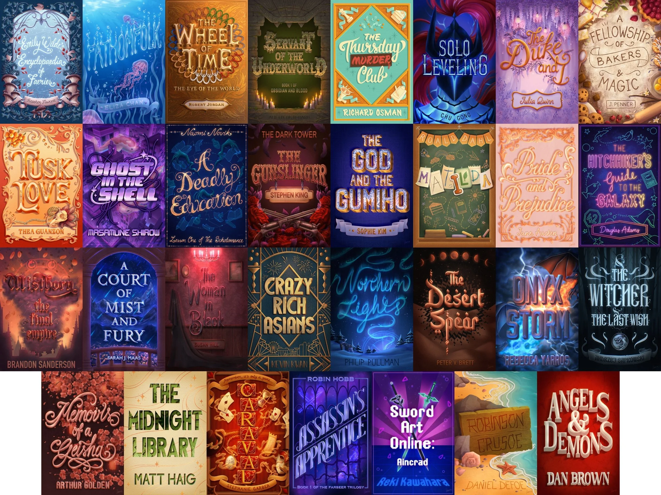
ABCD Awards 2024!

Last night (Thursday 7th March) saw the convergence of Britain’s best and brightest book cover designers at Gigi’s in Hoxton for the 11th Annual Academy of British Cover Design awards.

It was the first time being held in the bar upstairs and I think we were all grateful for the increase in space and the improved ventilation :)

ABCD Awards 2024!

Eric C. Wilder on Creating a Triptych for Open Letter Books

I have previous experience as a packaging designer, so when I get a series like this I tend to look at it as though I’m developing a product line. That is to say, instead of developing three covers for three separate stories, I develop an overarching visual look, and then tailor that look to each individual story. It’s almost like creating a visual language, and then using that language to express three distinct ideas.

Eric C. Wilder on Creating a Triptych for Open Letter Books

Beci Kelly on Designing Berlin

This novel is centred around Daphne, a young and confused 20-something who has just moved to Berlin, seemingly in search of herself, but we never really know if we can trust her accounts of her life or what’s happening around her. Even her thoughts are rather distorted and almost dreamlike. It felt important to focus on Daphne and not the urban city itself, as with a title such as Berlin I didn’t want it to fall into the realms of non-fiction or indeed look too literal.

Beci Kelly on Designing Berlin

Jennifer Heuer Gets Creative with Analogue Techniques for Island City

In Laura Adamczyk’s novel Island City, we meet a nameless wry and wistful woman who has basically given up. She sells all her belongings and moves back to her hometown which she claims it’s the “perfect place to give up.” She parks herself in a dark local bar and begins to tell her stories to the indifferent regulars around the bar. We only hear her voice, never any of the strangers, or bartender, only her point of view. It’s basically a booze-soaked monologue as stories and memories blur from one to the other with forgotten missing holes as she continues on to drink three, four, and so on.

Jennifer Heuer Gets Creative with Analogue Techniques for Island City

COVER REVEAL: Voidopolis by Kat Mustatea

MIT Press’s forthcoming book Voidopolis is a hybrid digital artistic and literary project in the form of an augmented reality book, which retells Dante's Inferno as if it were set in pandemic-ravaged New York City. Written to reflect the author’s experience of COVID as the physical city emptied of people and activities, the book is printed with missing words and incomplete images. It is illegible in the printed form and readers must use an augmented reality app to read in full. However the app is designed to degrade over time — revealing less and less before renewing itself on an annual basis—an ingenious concept from author Kat Mustatea that physically reflects her rumination on loss and memory.

COVER REVEAL: Voidopolis by Kat Mustatea

Alban Fischer on Designing Bariloche

Bariloche is the story of a garbage collector from Buenos Aires obsessed with jigsaw puzzles and haunted by memories of first love. I was struck by the narrative’s dual focus of, on the one hand, actual deterioration (garbage) as it mirrors the protagonist’s spiritual depletion and physical exhaustion, and, on the other, the lyrical (represented in the rural scenes on the puzzles) as it parallels the protagonist’s idealized memories. I knew I wanted the cover to represent this polarity.

Alban Fischer on Designing Bariloche

Beth Kephart on Designing My Life in Paper: Adventures in Ephemera

It seemed to me that the primary tomes on the history of paper were dressed in versions of royal purple. And that books on the art of paper craft and binding were often celebrating multiples—many handmade journals, many bindings.

Might we avoid purple? I wrote to my editor, as discussions about the book’s look got underway. Might we develop something singular and centering?

Beth Kephart on Designing My Life in Paper: Adventures in Ephemera

Eric C. Wilder on Designing Everything That Hurt Us Becomes a Ghost

Everything That Hurt Us Becomes a Ghost is a poetry collection by deaf Indigenous author Sage Ravenwood, to be published this fall by Gallaudet University Press. For the cover the author wanted to incorporate images of ravens in some way. The brief stated “ravens represent the crossing of dead.” I could show elements, claws, feathers, anything that got the idea across. It was even suggested that I take a look at a bird that had passed on, which I found interesting.

Eric C. Wilder on Designing Everything That Hurt Us Becomes a Ghost

Kate Sinclair on Designing The Adult

The Adult is a gorgeously written, queer coming-of-age novel about innocence, identity, yearning, sex and poetry. It follows the story of college freshman Natalie—shy and solitary—who meets an older woman and is drawn into a relationship with her. 

When I was designing the cover, I started with the title. On the surface, the word ‘adult’ has no moral or dramatic character, it is just a noun. But in the context of the novel, it is a complicated question. What is an adult? When we say that two people are ‘adults,’ are we implying that they are equal? 

Kate Sinclair on Designing The Adult

Jaya Nicely on Designing Tweakerworld

Before I began designing this cover, I met with author Jason Yamas to hear more about his story. Tweakerworld is a memoir documenting Jason’s plunge into the ParTy n’ ‘Play (PnP) subculture in the gay community and his subsequent rise as a meth lord in the Bay area. While this book is about heavy topics like addiction, abuse and shame, Jason covers them with humanity and humor. After another discussion with the team, I knew that this cover needed to be fun at first glance, but when you look further you notice something is “off.” There’s darkness in the Tweakerworld, but no one sees it right away. That’s how you get sucked in. Jason offered to take photos of himself so I could use his face on the cover if I wanted. While he shot them, I worked on some other options.

Jaya Nicely on Designing Tweakerworld

Emma Dolan on Designing Tell Me Pleasant Things About Immortality

I’m a horror fan, so naturally I was excited when the cover brief for Lindsay Wong’s new book arrived in my inbox. I immediately asked Lindsay’s editor, Deborah Sun de la Cruz, for a copy of the manuscript. As I dug in, I paid close attention to the style and tone of the writing, attempting to draw out the visual personality of the story. If the book were an image, what would it look like? Tell Me Pleasant Things about Immortality is a collection of surreal and hilarious immigrant horror stories that mixes ancient myth with modern day social satire, explores themes of family, trauma, vanity and love, and is populated by a gruesome assortment of ghouls, ghosts and zombies. This was going to be interesting!

Emma Dolan on Designing Tell Me Pleasant Things About Immortality

Emma Pidsley on Designing Wandering Souls

Wandering Souls follows the journey of three siblings as they flee their Vietnamese village at the end of the war and embark on a perilous boat journey to Hong Kong, which tragically, the rest of their family do not survive. They go on alone to navigate refugee camps and resettlement centres until arriving in Britain. As they strive to find a new sense of home and connection, the siblings’ narrative is interwoven with the voices of their lost brother Dao, and an unknown researcher who pulls together fragments of their story. This felt like a special novel from the outset, and an important story to tell. It was clear that the cover needed to look unique and captivating, but also convey the sense of loss and heartache at the centre of the story.

Emma Pidsley on Designing Wandering Souls

Myunghee Kwon on Designing Blue Hunger

As a designer, the process of creating a book cover can be challenging, especially when it comes to translating the essence of the story into a visual representation. However, for Blue Hunger, the process was an exceptional one. In fact, the book was so visually compelling that ideas for the cover design started forming in my mind as I read through the manuscript.

Myunghee Kwon on Designing Blue Hunger

Freelance February: Emma Rogers on Designing Ready For It

Ready For It follows two best friends, Natalie and Fiona, whose friendship falls apart when they approach 30. Fiona moves in with her long-term boyfriend, leaving Natalie wondering how on earth she is going to pay the rent on her own. Just as Natalie is at breaking point, she hears about her dream job and flying solo suddenly doesn’t seem so daunting, until she realises that Fiona has applied for the same role. Will their friendship struggle to survive as they navigate the tricky changes in life that they're not sure they're ready for? Ready for It is a book about not being ready for the next steps in life and having to either fake it or try and make it. It’s a warm, funny, hopeful and emotional read.

Freelance February: Emma Rogers on Designing Ready For It

Freelance February: Will Staehle on Designing Scorched Grace

While I’ve been designing covers for quite a few years now, this project held a handful of firsts for me. This was my first job for Zando Projects, as well as my first cover for Art Director Evan Gaffney - whose work I’ve always enjoyed, but we'd never worked together before.

Freelance February: Will Staehle on Designing Scorched Grace

Gregg Kulick on Designing Age of Vice

Helen Yentus reached out to me to work on this one in the fall of 2021. She had no specifics for any of the imagery, but really wanted to capture the excitement, action, opulence and grit of the book. It is also a big book for them and there was a lot of excitment in house for it.

Gregg Kulick on Designing Age of Vice

Mark Abrams on Designing Motherthing

Motherthing is dark, weird, funny. The protagonist, Abby Lamb, is a wife desperate to get pregnant, but her husband can’t commit, as he’s hopelessly depressed by the death of his mother (i.e. Abby’s mother-in-law), who is haunting him. Abby starts off as a bit cheerfully unhinged, obsessed with a retro fantasy of domestic life of bliss and potential mothering, making dishes like jellied salmon—which haunts the book as frequently as her mother-in-law’s ghost from the basement—and she graduates to fully unhinged by the book’s end. There might be a bit of murder and cannibalism, depending on how reliable you find the narrator.

Mark Abrams on Designing Motherthing

June Park on Designing Katherine Dunn's Toad

Katherine Dunn published her best-selling, National Book Award finalist novel Geek Love in 1989, which quickly catapulted her into a cult classic status. Before Geek Love, she wrote a novel that was rejected by her publisher, that then sat in an archive for nearly half a century until Editor Naomi Huffman dug it up and brought it to light. Toad, published posthumously by MCD Books, is a dark and edgy portrait of a young woman who over the course of the novel retreats from society into a self-imposed exile. Dunn’s writing is discomfiting, absurd, grotesque, yet lyrical and captivating. As the editor puts it, Dunn’s work “delights in making the reader squirm”, so we thought that’s exactly what we’ll do with the cover.

June Park on Designing Katherine Dunn's Toad

Kelly Winton on Designing a Beautifully Vivid Cover for Blood Red

The cover design for Blood Red came together very organically. I was hired as a freelancer by Restless Books and worked with Alison Gore who art directed the project. The cover memo had very specific and interesting art direction, Alison even provided a Spotify playlist for the book (which was a first for me!) and a Pinterest board of images. I was excited to begin working on it.

Blood Red by Gabriella Ponce and translated by Sarah Booker is a novel written like a fragmented narration by a female protagonist going through a break-up and an unplanned pregnancy. She is forced to confront her body in a new way and there are a lot of striking visuals. The novel is an exploration of sexuality, menstruation, the female form, and the conflicts women face with pregnancy and motherhood.

Kelly Winton on Designing a Beautifully Vivid Cover for Blood Red

Colin Webber on Designing The Lemon

The Lemon’s unique story is the product of Kevin Alexander, Joe Keohane, and Alessandra Lusardi collaborating under the Pen Name: S.E. Boyd. From a design perspective this was of course a major relief – Other writing trios take note! Each one brought their own experience and background together to craft an uncanny story that effortlessly blends the worlds of food, media, and celebrity into a darkly hilarious, high-stakes adventure.

Colin Webber on Designing The Lemon

Emma Ewbank on Designing a Truly Original Cover for Losing the Plot

Losing the Plot is a novel about a son’s search to understand his mother’s past. This beautiful piece of work explores a young woman who has been uprooted from her homeland of Ghana to the grey streets of Tottenham, London, and having to adapt to a hostile and isolating cultural environment. Working three jobs as well as trying to raise a family. The narrative is experimental, even hard to read at times, written in prose poem English and Twi (Ghanaian dialect), as well as being commented upon by the son from the margins of the book. Being such an experimental piece of writing, this was a dream book to land on my lap, as the cover would also have to reflect this unusual creative style in some way.

Emma Ewbank on Designing a Truly Original Cover for Losing the Plot

Design Studio Milk & Bone's Designer Alicia Raitt Re-Imagines All 14 of Kurt Vonnegut’s Book Covers to Celebrate His 100th Birthday

Today (11th November 2022) is the anniversary of Kurt Vonnegut’s 100th birthday, and tonight, a collection of Plymouth artists will present ‘Kurt Vonnegut, Centenary Celebration’, an exhibition featuring poetry, art, music and film inspired by the novels of this legendary author.

As part of the collective’s creative output, Milk & Bone designer Alicia Raitt has re-imagined all 14 of Vonnegut’s book covers.

Design Studio Milk & Bone's Designer Alicia Raitt Re-Imagines All 14 of Kurt Vonnegut’s Book Covers to Celebrate His 100th Birthday

Beginning to End - Dark Factory: Creative Collaborator, AV/VR Design of Dark Park, Charlie Athanas

My creative collaboration on the project started with someone I had never met (but not a stranger) appearing in my Twitter DMs with a question. “Hi Charlie! If you ever want to chat about AR/VR, I would love to hear your stories/perspectives.” Since it was Kathe Koja, whose many books lined my bookshelves, I was surprised, intrigued, and more than willing to talk with her about Augmented and Virtual Reality. She was working on Dark Factory, an “immersive novel” which involved a nightclub featuring futuristic technology that allowed the high-end guests to play around with reality. Kathe was interested in what was currently feasible in reality-shifting technology and what was coming down the pipeline.

Beginning to End - Dark Factory: Creative Collaborator, AV/VR Design of Dark Park, Charlie Athanas